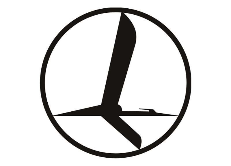
LOT logo
.coreimg.jpg/1750144031365/embraer-e2-vertical-stabilizer (1).jpg)
The crane - a symbol of happiness, prosperity and longevity, as well as a synonym for the tenacious aviator - has featured in LOT Polish Airlines' logo for 95 years. The graphic designer responsible for its design is Tadeusz Gronowski, one of the pioneers of the Polish poster school and a graduate of the École Supérieur des Beaux-Arts in Paris.
Gronowski's winning project
The logo was designed at the turn of 1929 and 1930 for a competition announced by the newly established LOT airline. Gronowski's winning design depicts a stylised crane flying in a circle.

Timeless design
The logo was so timeless that it was only nearly 50 years later that it was delicately altered by the duo of Roman Duszek and Andrzej Zbrożek, whose task it was to create Poland's first comprehensive visual identity system - precisely for LOT.

From typefaces, letterhead designs, business cards, facility signage to painting the aircraft. The starting point was for the logo to be legible and recognisable from a distance. And it is this version of the logo, with the crane designed by Tadeusz Gronowski as its integral part, which has functioned to this day, giving the best testimony to the Polish art of graphic design, while at the same time being Poland's ambassador in every country we have flown to since 1929.